🎯 What is SafeHome?
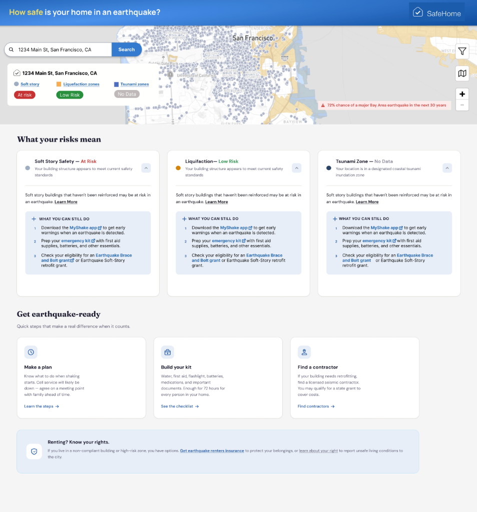
SafeHome is a simple, highly accessible website tool designed to help the general public determine if a specific San Francisco address is at risk during an earthquake.
The current risks assessed are generated entirely from high-quality government datasets, evaluating:
- Soft-Story Property Status: Poorly reinforced wooden buildings (classified by the City of SF).
- Tsunami Flood Zones: Coastal hazard areas (calculated by CA USGS).
- Soil Liquefaction Zones: High-risk ground instability areas (calculated by the City of SF).
The Scale of Impact
7 Million+
The San Francisco Bay Area is home to over 7 million residents, sitting directly atop some of the most active fault lines in the world. Despite the extreme density and immense risk, actionable property-level data is incredibly fragmented. The impact of this project is potentially life-saving for millions.
⚠️ UX Pain Points
While the state and city collect phenomenal data, existing government resources are not user-friendly to the general public and are practically invisible to average renters and buyers.
💡 UX Focus & Ideation
Our core UX philosophy is straightforward: Shift the cognitive load to the system. The goal is to make this existing data fully usable and highly visible to renters and buyers in SF so that, ultimately, this awareness forces property owners & developers to upgrade building safety.
🗺️ User Journey & IA
To address these pain points, we overhauled the Information Architecture of the Earthquake Safety App. The new journey deliberately separates resources into actionable, contextual phases: Pre-Event, During Event, and After Event.
SafeHome
Map interaction
📈 Data Science Alignment
I collaborated closely with the Data Science team to translate raw government datasets into accessible frontend metrics. Here is how that data impacted our strategy:
🧠 Process Deep Dive
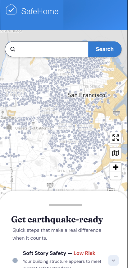
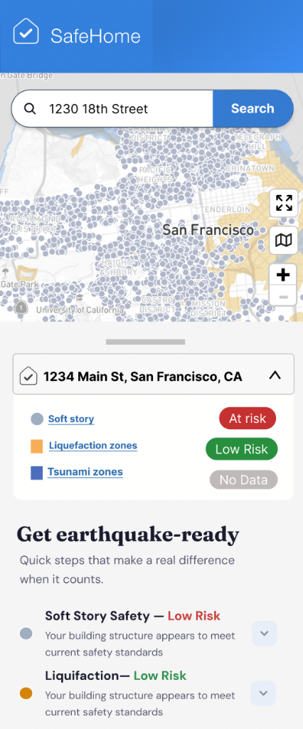
Mobile-First Approach
Real estate moves fast in San Francisco. A renter might be standing outside an apartment building they're touring right now. By prioritizing a mobile-first design strategy, we ensured the tool functioned as an immediate "pocket safety inspector" rather than a dense desktop research portal.
Strategic A/B Testing
We recognized early on that users process civic data differently. To definitively validate our core navigation pattern, we are conducting a strict A/B test between two vastly different homepage philosophies:
Map-Centric Approach
A highly visual, exploration-based interface that loads the interactive map immediately, allowing users to browse neighborhood heatmaps.
Option A: Map-Centric
Alpha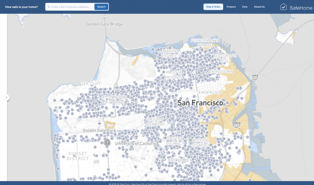
Non-Map-Centric Approach
A highly focused, search-based interface that forces the user to input an exact address before revealing any geospatial data.
Option B: Non-Map
Beta
🧗 Challenges
Qualitative Artifacts
- Translating incredibly dense structural engineering jargon into understandable civilian language without losing accuracy.
- Maintaining high momentum and alignment in a completely remote, asynchronous volunteer organization.
Quantitative & Technical
- Designing lightweight UI components that don't choke the mobile browser when rendering heavily layered GIS vector chunks.
- Balancing data granularity vs load speed limits for mobile users over cell networks.
🤖 Catalyst: The AI Edge
Tool Stack
Exponential Velocity
Rapidly ideated architectural structures, drafted UX copy, and shipped high-fidelity screens. This bridged the alignment gap with developers, accelerating our two-week sprint cycles drastically.
🏆 Leadership & Results
The Wins
Wins Breakdown
Growth
Scaled reach 600% and acquisition 76%.
Trust
Sustained 6.5-minute, high-conversion sessions.
The Gaps
Learnings Breakdown
Friction
Severe mobile and journey drop-offs.
Retention
High churn despite visibility growth.
🔭 Learnings & Future Scope
We are actively building a foundation that scales. If we successfully validate this model in San Francisco, we plan to aggressively expand the platform using appropriate datasets to cover major Bay Area hubs (e.g., San Jose, Oakland).
New Disaster Cases
- Wildfire & Smoke indexing
- Real-time Flooding events
- Service Loss Notifications (power outages, cell drops, closed government services)
Future Website Features
- Offline mode routing
- SMS backup communication during major disasters
- Full language localization support for diverse Bay Area populations