Final Design Impact
60%
increase in sign ups
100%
resolution of customer communication issues

Established strong, credible online presence
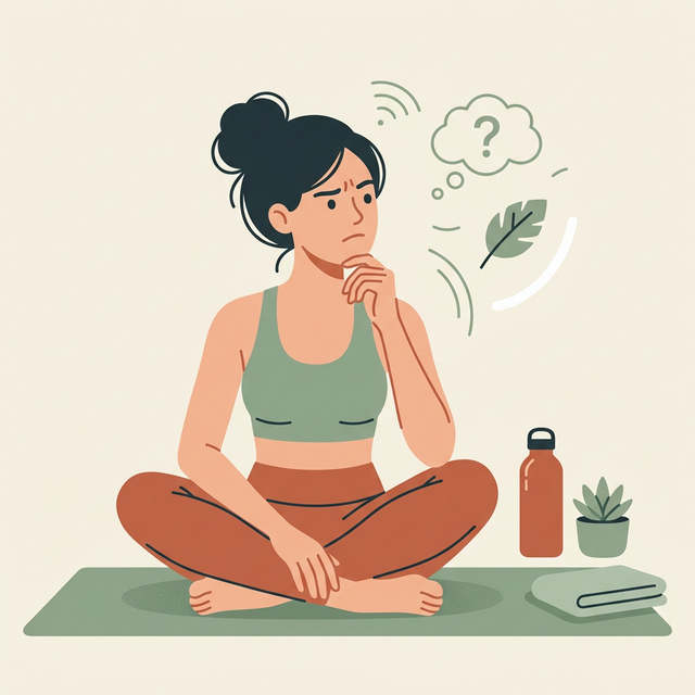
🤔 The Problem
Dr. Madhuri Rozal faced challenges converting website visitors into live online class students. Users struggled with understanding offerings, scheduling, and credibility, creating friction in the sign-up journey.
🎯 The Goal
Design an engaging, trustworthy website that clearly communicates class value, simplifies scheduling and booking, and seamlessly converts new visitors into long-term students.
⏳ Constraints
- Limited development budget
- Stakeholder new to digital
- Tight 4-month timeline
- Must launch fully functional
Concepts Explored
Design
Process
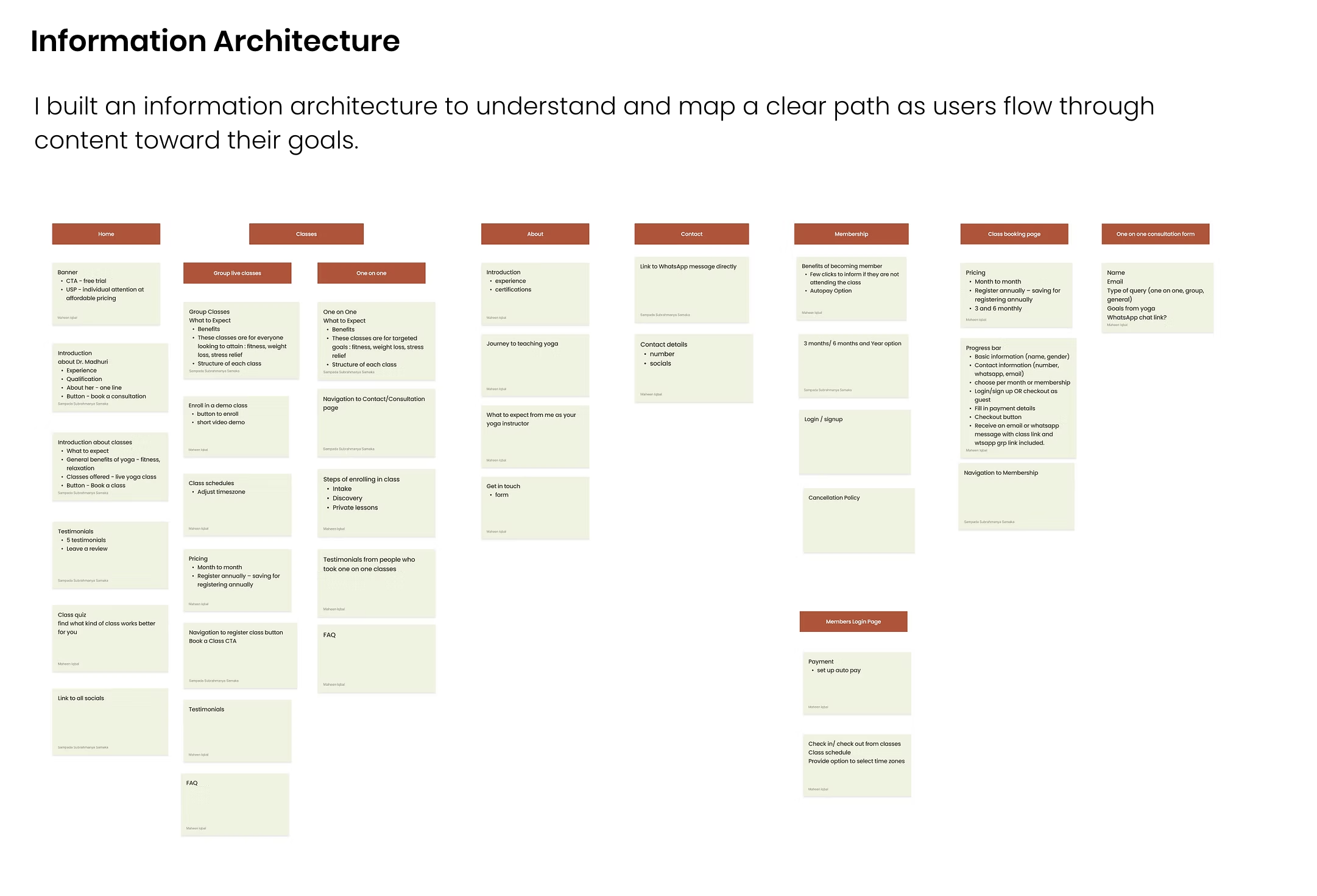
Research Approach & Insights
To understand potential students and their expectations from online yoga classes, I conducted surveys and interviews. This helped uncover motivations, barriers, and trust factors influencing their decision to enroll.
Quick Understanding
Users want to quickly grasp the benefits of yoga classes before committing time or money.
Credibility is Key
Instructor experience, background, and student testimonials significantly influence trust.
Clear Logistics
Flexible scheduling and completely transparent pricing are essential for sign-ups.
Low Friction Entry
Offering trial sessions dramatically helps reduce hesitation for first-time users.
Survey Highlights
66.7%
Prefer one-on-one over group classes.
77.8%
Prioritize high-quality instruction.
55.6%
Hesitate if pricing/reviews are missing.
55.6%
Prefer earthy, calming aesthetics.
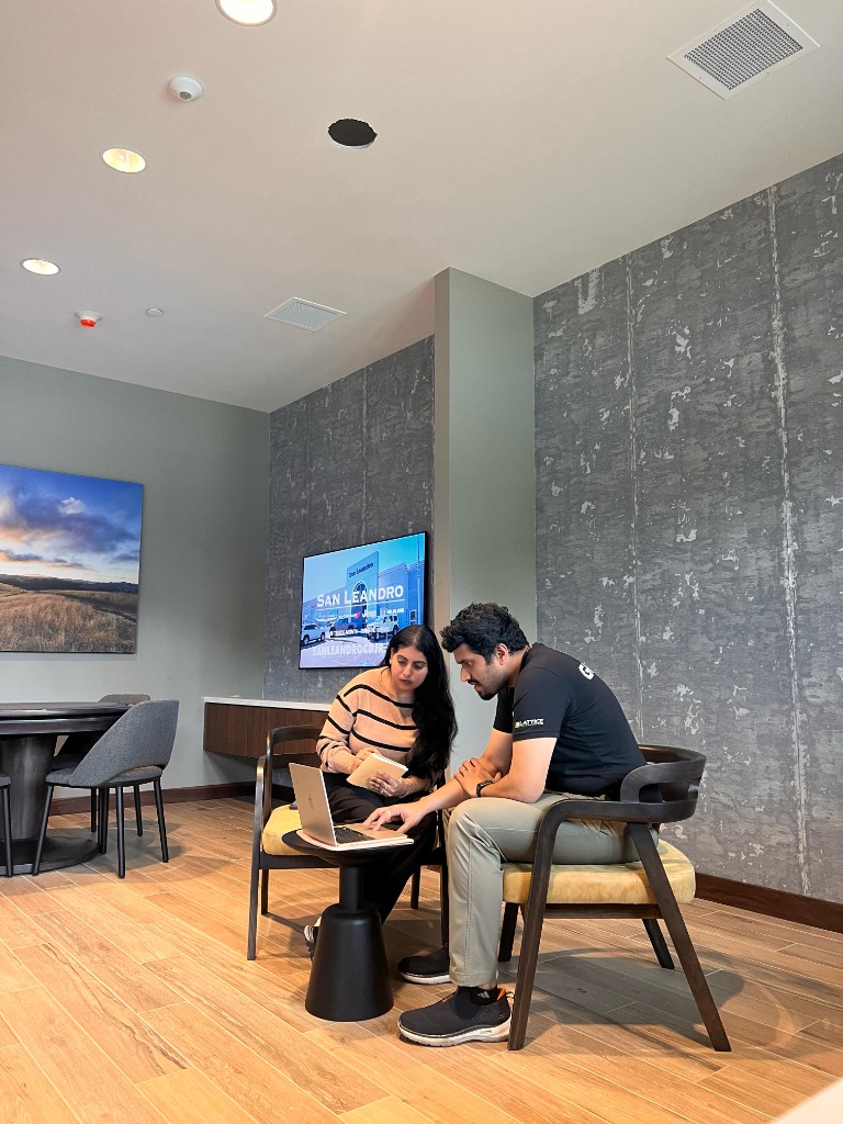
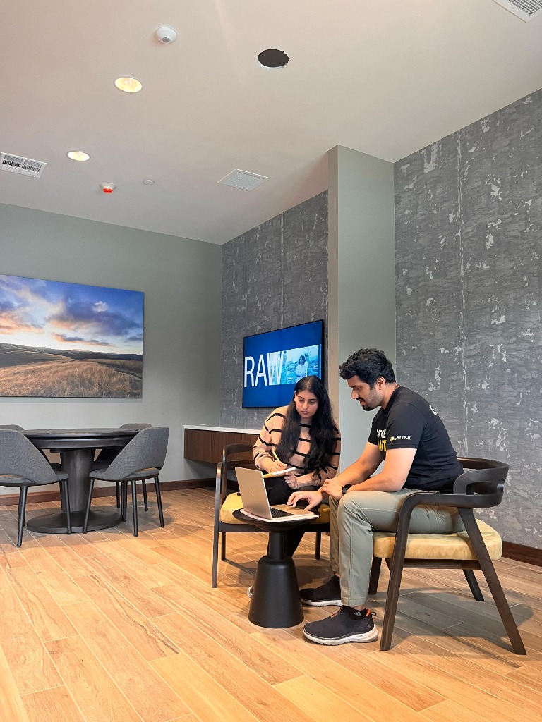
User Interview Sessions
User Interview Quotes
Target Personas


A/B Testing
Before finalizing the visual direction, I created two distinct concepts for the home page. The goal was to determine which layout, tone, and color palette established the most trust and clarity for potential students seeking online yoga classes.
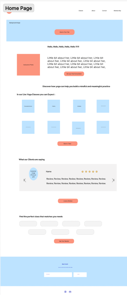
🏆 The Result: Design B
Through user preference testing, Design B was chosen as the winner. This test focused exclusively on the framework and information architecture, not visual styling or color palette. Users found Design B's structured layout and clear information hierarchy much easier to navigate, successfully reducing friction during the class selection and booking flow.
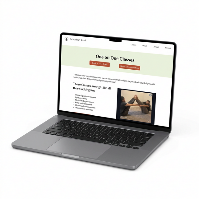
Solution
I designed a website that reflects the essence of Dr. Madhuri Rozal's yoga practice and values. It
simplifies navigation, ensures brand cohesion, and clearly communicates class details and
benefits.
The site bridges knowledge gaps for beginners while building trust with potential clients. Overall,
it establishes a warm and credible online presence that supports class conversions.
Design Strategy
Using the research insights, I structured the experience around three principles: clarity, trust, and simplicity. The design focused on guiding users toward the right class quickly while reducing friction in booking.
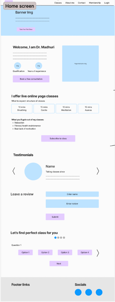
A Glimpse of Design Solutions
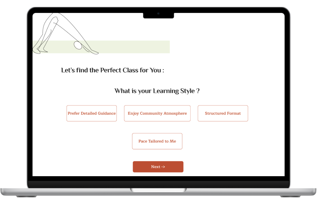
Guided by User Intent
To help users discover the right class effortlessly, I introduced an interactive slider with personalized questions. This reduced friction in navigation by aligning user intent with class offerings making it quicker and easier for new visitors to find what suits them best.
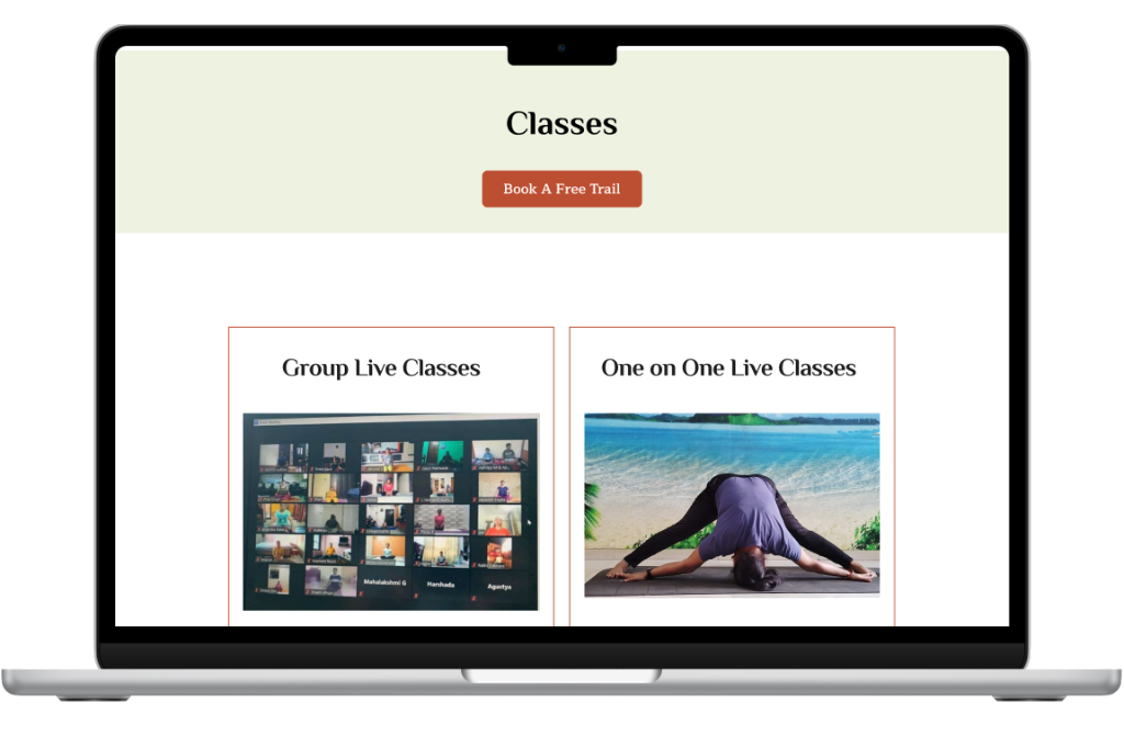
Decisions Made Simple
To help users choose between one-on-one and group classes, I added a side-by-side comparison layout highlighting key differences and pricing. This allows for quick, informed decisions without extra clicks.
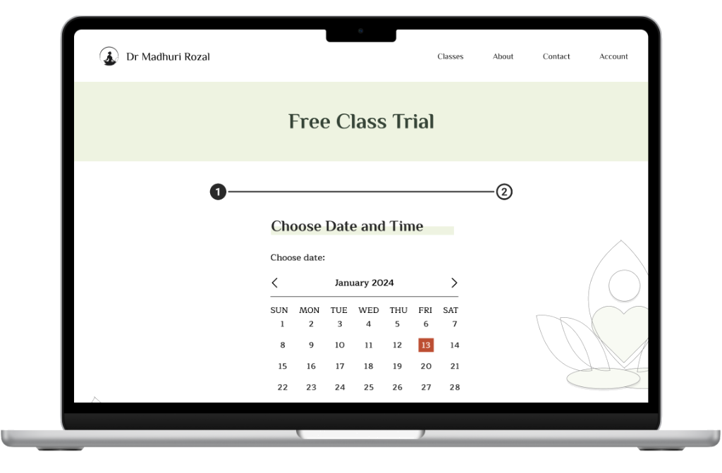
Made Booking Free Trial a Breeze
To ensure users never miss the free trial offer, I placed a clear CTA right at the top. I also introduced a calendar view with automatic time zone adjustment, so users can easily select their slot. With just a few basic details, users instantly receive a Zoom link they can easily copy, share, or click to join their session.
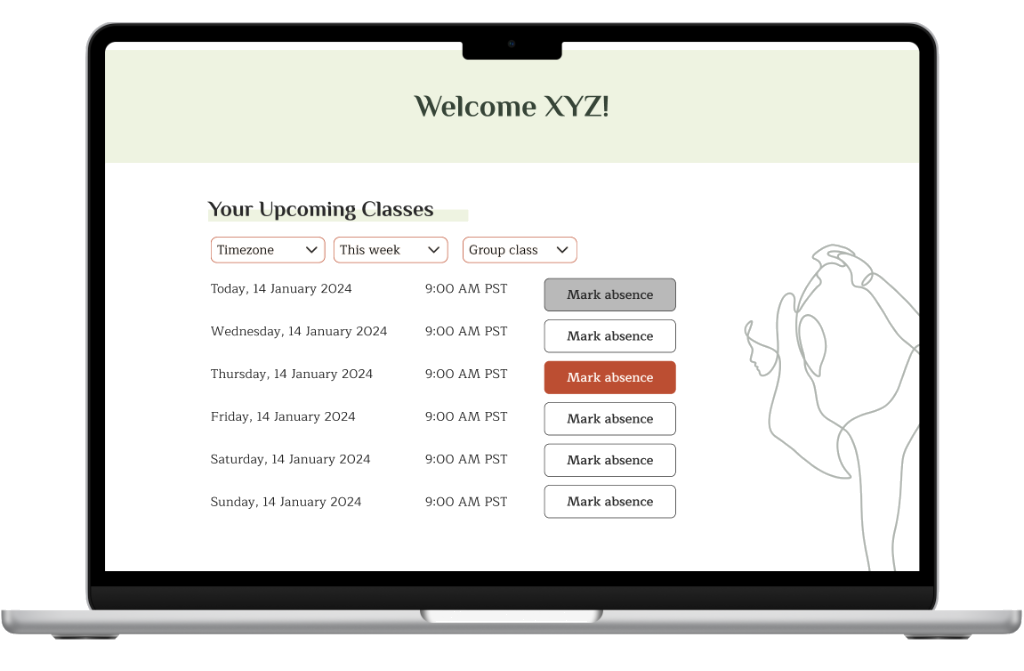
Eliminating Communication Gaps for Absence Notifications
On the member login page, I simplified communication by introducing a calendar view and a one-click option to mark absences. This eliminated the need for members to constantly inform the instructor via WhatsApp, which had been creating gaps in communication.
Usability Testing
Tested high-fidelity prototypes with 10 participants (8 new clients) focusing on class discovery and booking. The goal was to ensure the new architecture reduced friction and accurately guided users.
100%
Task Completion
62s
Avg. Task Time
80%
Found Info Digestible

What I Learned
This project strengthened my ability to design under constraints and collaborate with non-technical stakeholders. Balancing user needs with business goals required iterative testing and rapid decision-making. The experience reinforced the importance of usability testing, clear information architecture, and designing for trust in service-based platforms.